Memorial Color Ideas: How to Choose Colors That Honor Someone
The best memorial colors are the ones that mean something to your family. Start with what your loved one wore, loved or surrounded themselves with. Then add one or two quiet neutrals so the color has room to breathe. Tradition can guide you, but it doesn’t have to decide for you.
If you are here, you may be planning a service, a memorial table, a program or an online tribute, and the choices can feel strangely heavy. We’ll walk through what colors have traditionally meant, how to build a palette that feels personal, and how to carry it through flowers, keepsakes and a lasting digital memorial.
TL;DR
- Black is the main mourning color in most of North America, but white, gray, blue, green, purple and soft pastels are all welcome in modern memorials.
- Pick one anchor color, add two neutrals, then repeat the meaningful color lightly in small details.
- Ask “What does this color mean to us?” rather than “What does it mean in general?”
- Cultural and religious traditions differ, so check with family before you finalize a palette.
- For a digital memorial, choose calm colors and keep text and photos easy to read.
Table of Contents
- Why color matters when we remember someone
- What the traditional mourning colors mean
- A quick guide to colors and their feelings
- How to build a palette that feels personal
- Making the color personal with a favorite shade
- Colors for flowers, programs and keepsakes
- Colors that honor a pet
- Honoring different traditions with care
- Colors for a digital memorial
- Our perspective
- Bring your palette into a lasting memorial
- Frequently asked questions
- Sources
Why color matters when we remember someone
Grief arrives without warning, and in the days that follow, many of us look for something to hold on to. Color is one of the gentlest tools we have. A deep green ribbon, a favorite yellow scarf or a soft blue photo mat can say what words cannot.
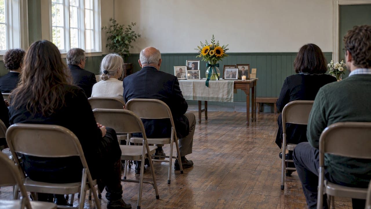
Color also sets the mood of a gathering before anyone speaks. A room of white and cream feels quiet and formal. A table of sunflowers and bright photographs feels like a celebration of a life. Neither is wrong. The right choice is the one that sounds like the person you are remembering.
What the traditional mourning colors mean
Most families in the United States know the basics: black for mourning, white for peace. The history is richer than that, and knowing it can help you decide what to keep and what to leave behind.
Black
The Conversation notes that black is the main mourning color in Europe and in countries strongly influenced by Europe, including most of North America. Black carries solemnity, respect and the weight of loss. It remains a safe, dignified choice for clothing, programs and printed cards.
White and cream
In many Western settings, white stands for peace and purity. In much of Asia, it is the color of mourning itself. Funeral.com’s guide to mourning colors by culture gives the example that historically Chinese funeral dress was generally white. If your family or guests come from more than one tradition, white can carry two meanings at once, and it is worth a quiet conversation beforehand.
Gray, silver and soft neutrals
Gray and silver feel calm and steady. They sit well beside almost any other color, which makes them ideal anchors. Neutrals such as white, cream, beige and soft gray create a serene, respectful atmosphere for formal or traditional services, according to The Funeral Program Site.
Purple and violet
Purple has long been tied to reflection. During the Victorian period, as the Smithsonian’s National Museum of American History describes, mourners in the later stages wore gray, violet, purple, mauve and white after a period in black crepe. In Catholic liturgy, purple or violet is tied to penance and reflection and may be used for Masses for the dead, as noted in Funeral.com’s guide above.
Blue and green
Blue and green are the colors many people reach for today. FuneralScreen recommends blue and green palettes for peace and tranquility. Deep green feels grounding, and soft blue feels like open sky or still water. They are a lovely fit for someone who loved gardens, hiking, fishing or the sea.
Yellow, cream and warm tones
Soft yellows and creams add comfort and warmth. Think of morning light through a kitchen window. They suit remembrance of someone known for kindness, humor or a sunny disposition.
Red
Red is powerful and personal. FuneralScreen suggests using it with caution in memorial displays, since it can suggest passion and urgency. A single red rose, a red scarf in a photograph or a favorite team color can still be deeply moving. Used sparingly, it becomes an accent rather than the whole story.
A quick guide to colors and their feelings
| Color | Common feeling | Works well for |
|---|---|---|
| Black | Solemnity, respect | Clothing, printed programs, formal services |
| White and cream | Peace, purity (mourning in some Eastern traditions) | Flowers, backgrounds, candles |
| Gray and silver | Calm, steadiness | Neutral anchor, urns, frames |
| Blue | Serenity, reflection | Water lovers, digital memorials, photo mats |
| Green | Grounding, renewal | Gardeners, nature lovers, memorial tables |
| Purple and lavender | Reflection, spirituality | Faith-centered services, gentle accents |
| Yellow and peach | Warmth, comfort | Celebrations of life, sunny personalities |
| Red | Passion, love, intensity | Small accents, a signature favorite |
These meanings are tendencies, not rules. Your own history with a color matters far more than any chart.
How to build a palette that feels personal
A memorial palette doesn’t need to be complicated. Here is a simple approach that many families find steadying.
- Begin with the person. Think about what they wore, decorated with or loved. Funeral.com suggests asking “What does this color mean to us?” instead of what it means in general.
- Choose an emotional tone. Do you want the day to feel quiet and reverent, warm and bright, or something in between? Neutrals and deep tones lean formal. Pale blue, lavender, peach and mint green evoke tranquility when the focus is on life and light rather than mourning.
- Pick one anchor color and two neutrals. A deep green with cream and soft gray is an example of a harmonious trio.
- Repeat the meaningful color lightly. Funeral.com describes this as a thread: a ribbon, a program accent, a flower, a photo mat or a small candle.
- Check it with family. A sibling or elder may have a strong sense of what feels right, and a short conversation can prevent hurt later.
Three example palettes
- The gardener: soft sage green, cream and warm gray, with white and pale pink blooms. The Funeral Program Site suggests soft green tones and floral designs for someone who loved gardening.
- The sea lover: calm blues, sand and white, with shells or wave motifs, an idea the same site offers for an ocean passion.
- The storyteller with a favorite color: navy and ivory as the base, with one bright accent such as sunflower yellow on the ribbons and the program cover.
Making the color personal with a favorite shade
Sometimes a single color says it best. Sagel Bloomfield Funeral Home writes that celebrating a loved one’s favorite color can honor their individuality and surround a family with reminders of what made that person special.
Some ways families do this:
- Ask guests to wear a touch of the color, such as a tie, scarf, pin or ribbon.
- Place a vase of flowers in that shade beside a framed photograph.
- Use the color for the guest book cover or the memorial candle.
- Print the service program with a border or heading in that shade.
You don’t need to do all of these. One or two small touches are enough.
Colors for flowers, programs and keepsakes
Flowers
Flowers carry their own meanings, and those differ by place. Proflowers explains that white chrysanthemums are a symbol of grief in Asian countries and a symbol of death in European countries, while in the United States they are typically seen as lighthearted flowers that honor a life. The same source notes that lilies are commonly associated with new beginnings, and in Christianity with the renewed innocence of the departed soul.
If your guests come from several backgrounds, white roses, soft greens or flowers your loved one actually grew are a warm, widely understood choice.
Printed programs
For printed programs, black text on white or cream backgrounds works best, and colors should stay subtle so they don’t distract from the words. Save your meaningful color for a border, a heading or a small ribbon.
Church and faith settings
If the service takes place in a church, the season and the liturgy may already suggest colors. This guide to liturgical color and church decor can help you think about atmosphere, and your pastor or priest can tell you what is customary in your congregation.
Urns and keepsakes
A memorial urn, a framed photograph or a keepsake box often looks best in a quiet neutral, with color kept for a ribbon, a flower or a mat. This keeps the object timeless while still feeling like them.
Colors that honor a pet
Losing a pet is real grief, and your palette can reflect that bond. Funeral.com says pet memorial colors can mirror a pet’s personality. Some families choose the color of the pet’s collar, or a color that stands for the feeling the pet brought into the home.
A few gentle ideas:
- Soft blush and sand for a quiet, cuddly companion.
- Bright yellow or orange for a playful, energetic dog.
- Sage green and cream for a cat who loved sunny windowsills.
- A full rainbow for those who feel comforted by the Rainbow Bridge poem. A memorial in Holland, Michigan features a 10-foot rainbow arch with a plaque of that poem.
For more ways to mark the day, our pet remembrance day ideas and aftercare tips offer a gentle checklist, and Coping with the Loss of a Pet speaks to the grief itself.
Honoring different traditions with care
Families today often blend cultures and faiths. A grandmother may expect white, a cousin may expect black, and a friend may arrive in bright colors because that is how they celebrate a life.
A few practical guidelines:
- Ask first. If you are unsure what an elder or relative expects, ask them quietly before the service.
- Say what you hope for. A short note such as “Please wear whatever feels right, and a touch of green if you’d like” lets guests know the dress code is gentle.
- Let both meanings stand. White can be peace to one guest and mourning to another. Both are true, and both can be honored.
Rituals often matter more than rules. If you are thinking about how meaning shapes remembrance, this reflection on grief rituals and meaning may speak to you.
Colors for a digital memorial
An online memorial is a place people can return to for years, from anywhere in the world. That makes color choices a little different from a one-day service.
Keep it calm. Soft blues, greens, creams and warm neutrals are easy on the eyes during long visits. Save strong colors for small accents.
Protect readability. Tributes and messages need to be easy to read. Use dark text on light backgrounds or the reverse, with strong contrast, and avoid busy patterns behind words.
Let photos lead. Photographs bring their own colors. A quiet background lets a favorite snapshot be the brightest thing on the page.

Echo one meaningful color. Whether it is a favorite shade in a cover photo, a banner or a keepsake book, a single repeated color gives the page a sense of home.
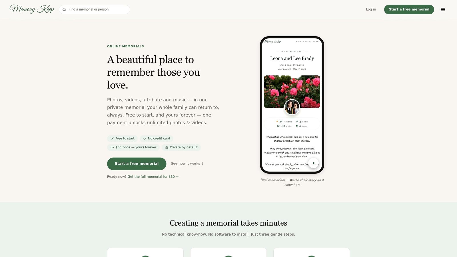
You can also create printable keepsakes that match. On Memory Keep, programs and keepsakes generate automatically from the memorial, so the look you choose carries through. If you would like to see what a finished tribute looks like, visit In Memory of Buddy or In Memory of Jupiter. For a couple honored together, see Leona and Lee Brady.
Our perspective
We have spent a lot of time with families at the moment they decide how to remember someone. Almost always, the color question is really a question about love. What did she wear when she laughed? What did he plant every spring? What did the dog’s collar look like against the grass?
We believe a memorial should feel like the person, not like a template. That is why we build each Memory Keep page to hold unlimited photos, video, audio and written tributes, so the colors and moments that mattered can live together in one place. Free scannable QR codes for headstones or cards, a curated music library organized by feeling, and printable programs and keepsakes that generate from the memorial all help one thoughtful choice carry through every part of remembrance.
We also believe grief should not come with a subscription. Our one-time payment model means no renewals, no ads and no selling of your data. Your loved one’s page can stay quietly in place, in the colors you chose, for the people who come to visit.
Memory Keep
Bring your palette into a lasting memorial
Once you know the colors that feel right, you can give them a permanent home. Memory Keep lets you create a memorial page for a person or a pet, gather photos and videos from family and friends, add tributes and share one unique link with loved ones anywhere.
Our Free plan lets you begin with limited uploads and features. The Full plan is a one-time $15 payment, with no subscription, for unlimited photos, videos and features. See both on our pricing page, or start from memorykeep.online.
If you are supporting someone else through this season, How to Support a Grieving Friend and Creative Ways to Honour a Loved One offer more gentle ideas.
Frequently asked questions
What color is best for a memorial service?
There is no single best color. Black remains the most familiar choice in the United States, while white, gray, blue, green and soft pastels are all widely accepted. Choose the colors your loved one loved, and anchor them with a neutral.
Is it appropriate to wear bright colors to a memorial?
Often, yes. Many families now invite guests to wear a favorite color of the person who died. If the invitation doesn’t say, a muted version of the color or a small accent is a respectful middle ground, and you can always ask the family.
What colors symbolize grief?
Black is the most common mourning color in Western culture, white in many Eastern traditions, and purple, gray and blue appear in various customs. Meanings differ by culture, faith and era, so treat them as a starting point.
What colors work for a pet memorial?
Choose colors that reflect your pet’s personality, such as the shade of a favorite collar or a color that captures the feeling they brought home. Soft sage, blush, sand and sunny yellow are popular, and so is a rainbow.
Can I change the colors of an online memorial later?
Yes, in spirit and in practice: a memorial grows as you add photos, tributes and keepsakes over time. You can keep refining how it looks as your feelings settle, and family members can contribute as well.
Sources
- Secular mourning clothes, The Conversation
- How first families have memorialized and mourned, Smithsonian National Museum of American History
- Mourning Colors by Culture, Funeral.com
- Color Symbolism Guide, Funeral.com
- Design Principles for Funeral Home Digital Signage, FuneralScreen
- Choosing a design and color scheme, The Funeral Program Site
- How to Celebrate Their Favorite Color in Memorial Tributes, Sagel Bloomfield
- Best Sympathy Flowers, Proflowers
- Best Canva Fonts for Elegant Funeral Programs
- Rainbow Bridge memorial offers solace, MLive
- Liturgical color and church decor ideas
- Grief rituals and meaning